

Key Takeaways
- Use a carousel only when swiping makes a task easier.
- Put the most useful choice first because many people may not swipe.
- Make additional content visible and easy to reach with more than one input method.
- Keep every card focused on one idea, item, step, or decision.
- Measure task completion and clarity, not swipe volume alone.
A mobile carousel is a horizontal group of related cards, images, products, or steps that users can explore by swiping or using controls. It can conserve space while supporting discovery, but it can also hide important information. Reviewing examples of mobile carousel UI can help teams recognize common patterns, but visual inspiration should never be the only reason to add one.
The strongest carousels have a clear job. They help someone compare similar choices, browse visual content, continue an onboarding flow, or find a relevant recommendation. When the component exists only to make a screen feel more dynamic, it often creates extra work instead of reducing it.
Start With the User Task
Before selecting card sizes, animations, or indicators, decide what the user needs to accomplish. A carousel can work well for related products, destination photos, recommended articles, short setup steps, date selections, or timely featured updates. The items should belong together and benefit from being explored one after another.
Ask four practical questions: Are the items closely related? Does horizontal movement feel natural for this content? Would a list or grid make scanning harder? Can the first visible card still offer value if the user never swipes? If the answer to the last question is no, reconsider the structure.
Make the First Card a Complete Starting Point
The first card carries the most responsibility because it may be the only one a user sees. Put the clearest option, best recommendation, or most likely next step first. Include a short heading, one useful detail, and one obvious action. Do not place essential pricing, eligibility terms, instructions, or warnings only on later cards.
For example, a travel app might lead with “Weekend in San Diego,” show the expected flight time and starting price, then offer a “View trip” action. Additional cards can present similar destinations, but the first card should already help the person make progress. Consistent card dimensions also prevent the row from feeling unstable as users move through it.
Show That More Content Exists
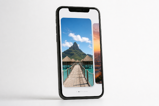
Users should not have to guess whether a row moves horizontally. A partial view of the next card is often the clearest cue for a browse-and-discover carousel. Deliberate spacing between cards can reinforce that cue, while labeled previous and next buttons provide a reliable alternative to swiping.
Position indicators can help with a short, ordered sequence, such as three onboarding steps. However, tiny dots should not be the only sign that more content exists. They are easy to miss and rarely explain what users will find next. Keep navigation cues visible without allowing them to distract from the card’s main message.
Keep Cards Focused and Scannable
Each card should answer one question or support one decision. On a small screen, a useful structure is simple: an image or visual cue, a short title, one supporting detail, and one clear action. Use readable text over images, strong crops, adequate contrast, and consistent calls to action across the row.
Avoid packing cards with multiple links, long descriptions, competing badges, and unrelated actions. If users need to compare many attributes at once, a list, comparison screen, or filterable grid will usually work better. Carousels are best for lightweight exploration, not dense evaluation.
Build Accessibility Into the Component
Accessibility is not an enhancement to add after launch. The accessible carousel guidance from the W3C emphasizes clear structure, keyboard operation, understandable updates, and user control over movement. Those choices also make the experience easier for everyone.
- Use buttons with meaningful labels, such as “Next destinations,” rather than an unlabeled arrow.
- Provide controls that work without touch gestures.
- Keep keyboard focus in a logical, predictable order.
- Use useful alternative text for informative images and avoid repeating decorative details.
- Respect reduced-motion preferences and do not rely on motion to communicate meaning.
- Ensure touch targets are large enough to use comfortably with one hand.
Use Auto-Advance Carefully
Automatic rotation can make a carousel feel active, but it can also interrupt reading, shift content before someone is ready, and create unnecessary pressure. Manual movement is usually the safer default for product details, instructions, account information, and notices that users need time to understand.
If auto-advance is necessary, keep the content brief, allow enough reading time, make the pause control easy to find, and stop movement when a user focuses on or interacts with the carousel. The first card must still provide useful information when the user does nothing.
Choose a Layout That Fits the Content
A peek-and-swipe row works well for related articles, products, and media. A one-card view is better for a focused step or a large image. Thumbnail strips can help users compare photos quickly, while a card stack may suit progressive decisions, but can hide useful context. When people need to scan many choices, a grid or plain vertical list is often the better mobile pattern.
Recent eye-tracking research on carousel interfaces found that users often focus directly on visible content items and may ignore carousel headings. Treat that finding as a useful design signal: make the visible cards understandable on their own, place strong content early, and do not assume users will read a section label before deciding whether to engage.
Test Behavior, Comprehension, and Results
A simple usability test can reveal whether the carousel is doing its job. Show participants the first card without explaining the interaction, then ask what they think they can do next. Check whether they notice additional content, find the intended action, and understand the difference between cards. Test on smaller screens, with one-handed use, keyboard controls, screen readers, and reduced-motion settings.
Compare the carousel with a list or grid version whenever possible. Track completion rate, selection accuracy, time to find the right item, engagement with later cards, repeated swiping, backtracking, and drop-off before the main action. High swipe counts alone are not a win. They may indicate that people are searching for information that should have been easier to find.
Common Mistakes and a Launch Checklist
- Do not hide essential content after the first card.
- Do not add several competing carousels to one screen.
- Do not use vague icons, tiny text, low contrast, or busy image backgrounds.
- Do not make a card look clickable unless its interaction is clear and consistent.
- Confirm that the carousel has one purpose, visible next-step cues, accessible controls, and a tested list or grid alternative.
A mobile carousel earns its place when it reduces effort and supports a clear choice. Lead with useful content, make browsing obvious, give users control, and validate the design against real tasks. If swiping adds friction instead of helping users move forward, choose the simpler list or grid.