

It is usually tempting when creating a chart or dashboard to use more colours. If you need to distinguish between two groups, go for red and blue; for three groups, include green. However, colour should not be relied on too much. About 8% of men and 0.5% of women have some kind of colour vision deficiency, so colour-coded charts often fail to be understood by part of your audience. Colour is completely removed in printed outputs and subtle shades tend to fade in projected slides.
A more effective method is to use preattentive texture. If you apply patterns such as dots, stripes, crosshatches, and grids to various data groups, you enable the human visual system to identify the different categories immediately, without having to use color. This principle is essential for accessible data visualization and should be something that every student attending a data analyst course in Chennai understands before they produce visuals intended for a general audience.
What Is Preattentive Processing?
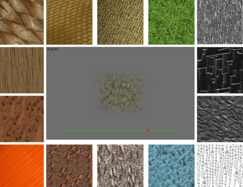
The ability of the brain to detect certain visual characteristics almost immediately—that is, before conscious attention has been focused on them—is known as preattentive processing. Studies in the field of cognitive psychology have found a number of visual features which the human visual cortex analyses in parallel and within less than 250 milliseconds; these features are orientation, size, shape, motion, and texture.
Texture — the repetition of a small visual element across a surface — is one of these preattentive attributes. When a bar chart shows one group with solid fill and another with diagonal stripes, viewers do not need to read a legend to understand that the two bars are different. Their visual system signals the difference automatically.
This is what separates preattentive design from ordinary formatting choices. The goal is not decoration. It is to reduce the cognitive load required to interpret a visual by aligning the design with how human perception naturally works.
How Texture Works in Practice
Texture is most often used in data visualization by means of fill patterns in various types of charts such as bar charts, area charts, pie charts, and maps; each data category is given a separate pattern, either in place of colour or in addition to it. Examples of such patterns include:
- Solid fill — a baseline for one group
- Horizontal stripes — clearly distinct from solid at a glance
- Diagonal lines (45°) — easy to differentiate from horizontal
- Crosshatch — a grid pattern for a third or fourth group
- Dots or stippling — useful for geographic maps and thematic fills
The essential thing about using texture effectively is to ensure there is contrast without introducing complexity. The patterns should be able to be distinguished at the size at which they are shown. A fine crosshatch, for example, may appear clear at full resolution but can end up looking like a dull gray when it is reduced in size for a slide. It is necessary to test the patterns at the actual size at which they will be displayed before deciding on the final visual appearance.
Tools like Tableau, Power BI, and Python’s Matplotlib library support custom fill patterns, though the level of native support varies. In Matplotlib, for example, the hatch parameter allows you to apply predefined patterns directly to bar or pie chart elements. Many professionals who complete a data analyst course in Chennai work with these libraries in hands-on projects, building visualizations that are both analytically sound and accessibility-compliant.
Texture and Accessibility: Why It Matters
Accessibility in data visualization is not an optional feature but rather a professional standard; those organizations which publish reports, dashboards, or infographics have a duty to make sure that their visual content is understood by all readers, including people who are colour blind.
The Web Content Accessibility Guidelines (WCAG) state that you should not depend on colour alone when conveying information. Among the most practical methods of meeting this requirement is the use of texture in the design of charts. A bar chart that uses both different colours and different patterns indicates group membership by means of two separate visual channels and is therefore more robust in different viewing situations.
Apart from accessibility, texture also has a value in monochrome situations—such as in academic papers, printed annual reports, and newspaper graphics—where colour reproduction is either unavailable or unreliable.
Practical Guidelines for Using Texture Effectively
Before applying texture in your next visualization, keep these principles in mind. Limit patterns to three or four distinct options — beyond that, viewers struggle to differentiate them reliably. Pair texture with color whenever possible, since using both channels together improves clarity for all audiences. Keep pattern scale consistent: elements should be large enough to identify clearly but not so dominant they obscure the data. Finally, always test your visual across devices and in print, since patterns that look sharp on a monitor may blur or merge when projected or photocopied
Conclusion
Apt and based on evidence, preattentive texture serves as a tool for enhancing the clarity and accessibility of data visualizations; it achieves this by using different patterns to distinguish between groups, which in turn reduces the mental effort required by the viewer and at the same time ensures that the visuals function adequately under color, print, and accessibility limitations.
It is the consideration of human perception that distinguishes capable analysts from outstanding ones; for those who are taking a data analyst course in Chennai, becoming proficient in preattentive design principles, such as texture, will enhance your capacity to communicate data effectively in any professional situation.