


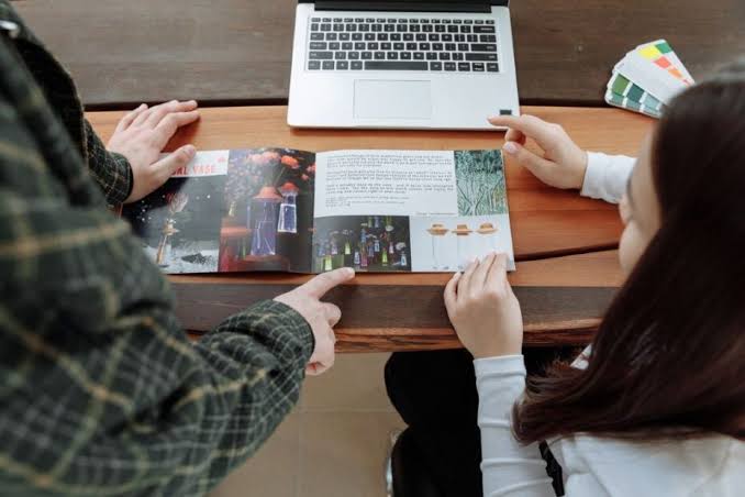
A printed guide succeeds when it helps someone do something without making them work to find the answer. Whether you are creating a visitor handbook, event program, employee manual, classroom packet, or neighborhood resource, the format should support the reader’s task. Well-planned printivity booklets can give instructions, maps, checklists, and key contacts a durable, easy-to-share home.
Print does not need to compete with digital information. A useful guide can keep essential details in readers’ hands while directing them to an update page for information that may change, such as schedules, registration status, prices, or expanded resources. The goal is not to include everything. It is to provide the right information at the moment a reader needs it.
Why Printed Guides Still Matter
A physical guide is especially helpful when people need directions, instructions, schedules, maps, or checklists as they move through a space or complete a task. Readers can mark it up, fold it open to a useful page, and refer back to it without switching between screens. Print is also a practical backup when internet access is limited or a phone battery is low.
At the same time, a printed item has limits. It cannot automatically update after distribution. Treat the guide as the dependable reference for information unlikely to change, and clearly point readers to a single digital destination for updates.
Start With One Clear Job
Every guide should solve one main problem. Before drafting, write a one-sentence purpose statement, such as: “This guide helps new volunteers complete their first shift confidently.” That sentence becomes a filter for every page. If a detail does not help the volunteer prepare, act, or find support, it may belong elsewhere.
Ask Three Planning Questions
- What should readers know before they begin?
- What should readers do next?
- What should they be able to find quickly later?
These questions prevent a common problem: turning a helpful guide into a collection of unrelated background information.
Define the Intended Reader
The same subject needs different treatment for a first-time event guest, an experienced employee, a student, or a customer. Consider what the reader already knows, the language they use, and the setting where they will use the guide. A person reading at a desk can manage more detail than someone checking instructions while walking, waiting in line, or doing hands-on work.
List the questions readers are likely to ask first. “Where do I go?” “What do I bring?” “Who can help?” and “What happens next?” are stronger starting points than an internal organizational structure. Replace unexplained jargon with familiar wording, and define necessary specialized terms the first time they appear.
Build a Content Map Before Designing
Plan the information flow before choosing colors, typefaces, or images. Start by listing reader questions, grouping related questions into sections, and placing urgent details near the front. Then arrange sections in the order readers will need them. Mark places where a map, diagram, checklist, photo, or form would explain information better than another paragraph.
This process helps reveal repeated content and missing steps early. Guidance on organizing communications around a clear audience action can also help teams focus their materials on what readers need to understand and do.
Make Each Page Easy to Scan
Most readers scan a page before deciding where to slow down. Give them visible signposts: descriptive headings, short paragraphs, numbered steps, bulleted lists, clear labels, page numbers, and enough open space to separate ideas. A crowded page can make even simple information feel difficult.
Keep instructions close to the information required to complete them. For example, place parking directions beside the parking map, not several pages away. Repeat critical labels so readers can open the guide at different points rather than reading from cover to cover.
Write in Plain, Direct Language
Plain language is not simplistic. It is writing that lets readers understand and act quickly. Prefer active sentences, familiar words, and specific directions. Instead of writing, “Participants are requested to proceed to the designated registration location upon arrival,” write, “When you arrive, check in at the registration desk.”
Direct language reduces hesitation. It also makes instructions easier to review because each sentence has a clear subject, action, and result.
Use Visuals That Add Meaning
Every visual should earn its space. Use maps for routes, diagrams for processes, charts for comparisons, photos for context, and icons for repeated labels. Decorative images can support the tone of a guide, but they should never compete with an important instruction or obscure essential text.
Add captions when an image could be misunderstood. Keep colors, icon styles, labels, and diagram conventions consistent throughout the guide so readers do not have to learn a new visual system on every page.
Plan for Accessibility and Print-Digital Use
Choose type that remains comfortable to read at the final printed size. Use strong contrast, avoid placing essential words over busy images, and do not rely on color alone to identify a warning or category. Leave room around text, forms, headings, and images. If your audience includes multiple language groups, consider whether translated versions or multilingual sections are needed.
QR codes can link readers to a registration form, a short video, an update page, or an expanded resource. Give each code one clear purpose, include a short typed web address as a backup, and test it on more than one phone. Keep essential instructions in print so readers are not blocked from completing a task.
Match the Format to the Task
A compact guide works well for quick reference, while a larger format may be better for detailed maps or visual instructions. Choose binding and paper with real use in mind. Guides that must stay open during training may need a format that lies flat. Guides used outdoors or passed among many people may need more durable materials. Include writing space when readers need to take notes, complete checklists, or make plans.
Review a Physical Draft Before Printing
- Print one copy at its intended size.
- Read it under normal lighting and turn pages in sequence.
- Check type size, margins, spacing, image clarity, and page flow.
- Test every QR code, web address, phone number, and contact detail.
- Confirm names, dates, times, prices, addresses, and instructions.
- Give the draft to someone unfamiliar with the project and watch where they hesitate.
Common Problems to Avoid
- Covering too many unrelated topics in one guide.
- Using tiny type to force in more content.
- Beginning sections with dense, unbroken paragraphs.
- Using too many fonts, colors, icons, or decorative elements.
- Hiding instructions inside promotional copy.
- Printing outdated contact information or schedules.
- Skipping a physical review before the final production run.
Final Checklist
Before approving the final version, ask: Does this guide have one clear purpose? Can readers find urgent information quickly? Are headings understandable, instructions direct, visuals useful, and text easy to read? Have all codes, links, dates, and contacts been checked? Most importantly, can someone who did not help create it use it without coaching?
A useful printed guide does not need to say everything. It needs to help the right reader take the next right step. Clear planning, readable design, practical visuals, accessibility checks, and an honest reader test can turn a stack of pages into a tool people keep and use.