

Understanding Color Theory
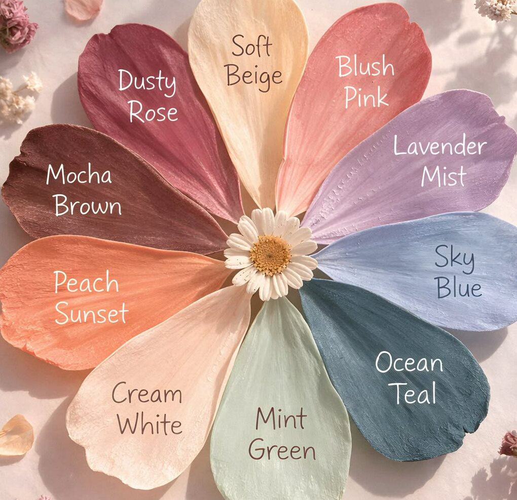
Color theory is an essential aspect of design, serving as the foundation upon which effective color palettes are built. The color wheel is a critical tool in this process, illustrating the relationships between colors. It primarily consists of three types of colors: primary, secondary, and tertiary. Primary colors—red, blue, and yellow—cannot be created by combining other colors. By mixing these primary colors, secondary colors—green, orange, and purple—are formed. Further combinations yield tertiary colors, leading to a more nuanced spectrum.
Colors are not merely visual elements; they significantly influence moods and perceptions. For instance, warm colors like reds and yellows tend to evoke feelings of warmth and excitement, while cool colors like blues and greens are often associated with tranquility and relaxation. Understanding these emotional responses can guide homeowners in selecting colors that align with the intended ambiance of a space.
Another fundamental aspect of color theory is the concept of complementary and analogous colors. Complementary colors are those that are opposite each other on the color wheel, such as blue and orange. When used together, they create a dynamic and vibrant contrast, ideal for focal points. Conversely, analogous colors are adjacent on the wheel, such as blue, green, and teal, providing a more harmonious and cohesive look. By realizing how complementary and analogous colors interact, one can develop a stunning and well-balanced home color palette.
Ultimately, mastering color theory assists in making informed decisions that enhance the aesthetic appeal of a home. By combining an understanding of the color wheel with the emotional properties of colors, individuals can create inviting and beautifully orchestrated spaces.
Assessing Your Space
Before selecting a color palette for your home, a thorough assessment of your space is imperative. The first aspect to consider is lighting, both natural and artificial. Different colors react uniquely under varying light conditions. For instance, a room illuminated with abundant natural light may present cool hues differently than those found in spaces with dim artificial lighting. To determine the best color choices, observe how the light interacts with your walls throughout different times of the day, noting the changes in hue and vibrancy.
Room size is another critical factor in defining your color palette. Larger rooms often can accommodate bolder or darker shades without feeling cramped. Conversely, smaller spaces might benefit from lighter, airy colors that can create an illusion of openness. It is essential to consider how the color palette can influence the perception of space, making it either feel more expansive or more intimate.
Additionally, take into account architectural features such as moldings, windows, and any unique structural elements in your home. These elements can serve as focal points and influence your color selections. For example, a home with traditional woodwork might call for a more vintage palette, while modern architecture may lend itself to more contemporary shades. Furthermore, existing furnishings should not be overlooked during this evaluation. Your color palette should complement rather than clash with your furniture, decor, and other design elements. This means assessing fabric colors, patterns, and styles to ensure a harmonious look throughout your home.
In conclusion, by meticulously evaluating the interplay of lighting, room size, architectural features, and existing furnishings, you can make informed decisions about your home color palette. This groundwork is crucial for creating a cohesive and aesthetically pleasing environment.
Identifying Your Style
Choosing the right color palette for your home begins with understanding your personal style preferences. Home decor styles can significantly influence color choices, as each style conveys a distinct atmosphere and emotional resonance. Among the most popular styles are modern, rustic, traditional, and eclectic, each offering a unique perspective on how colors can harmoniously work together.
Modern decor emphasizes minimalism and clean lines. Characterized by a neutral color palette, often enriched with bold accent colors, modern style allows for a sleek and uncluttered aesthetic. When selecting colors, consider cool tones like greys and whites, with splashes of vibrant colors for added depth, helping to create an open and airy environment.
On the other hand, rustic decor leans towards warm, earthy tones that evoke a sense of comfort and coziness. Think deep browns, warm beiges, and soft greens inspired by nature. This style often incorporates textured materials like wood and stone, which can guide your color choices toward warmer hues that complement these elements.
Traditional decor exudes elegance and sophistication, typically featuring rich, saturated colors paired with classic patterns. This style creates familiarity and nostalgia, ideal for those who appreciate timeless design. Colors often found in traditional homes include burgundy, navy, and emerald, which can create a sense of richness and depth.
Lastly, eclectic decor is a vibrant fusion of different styles and influences. When choosing colors within this approach, you have the freedom to mix and match bold hues, patterns, and materials. An inspiration board or mood board can be crucial in this process, helping to clarify your vision by visually assembling preferred colors, textures, and design elements. This tool serves as a creative guide, enabling you to explore various combinations until you find the palette that best represents your individual style.
Choosing a Color Palette
Embarking on the journey to select an appropriate color palette for your home can be an exciting yet daunting process. It is essential to ensure that the chosen colors resonate not only with the space but also mirror your personal style. To streamline this process, you can follow several systematic steps that facilitate a smoother selection experience.
The first step involves assessing the existing elements within the space. Consider the furniture, flooring, and natural light available. This foundational observation will provide a primary context that aids in making informed decisions. Once you have a clear understanding of these factors, you can begin to envision how different colors will interact with the surroundings.
A widely used guideline in interior design is the 60-30-10 rule. This principle indicates that 60% of the room’s color should be the dominant hue, typically the wall color. The secondary color should constitute around 30% and often appears in larger furnishings such as sofas or curtains. Finally, the remaining 10% is reserved for accent colors, which can be showcased through decor items such as pillows, artwork, or accessories. This balance helps in creating a cohesive look while adding depth to the design.
When exploring various combinations, you may come across three essential color palette types: monochromatic, analogous, and complementary. Monochromatic palettes utilize variations of a single color, fostering a serene and cohesive environment. Conversely, analogous color schemes are formed by selecting colors adjacent to each other on the color wheel, which promotes harmony. Finally, complementary colors, positioned opposite each other on the wheel, create dynamic contrasts, introducing energy to the space.
By carefully considering these elements and rules, you can effectively choose a color palette that not only enhances your home’s aesthetic but also reflects your personality, creating a harmonious living environment.
Testing Colors in Your Home
Choosing the right color palette for your home is a crucial step in creating a harmonious living environment. Before making a final decision, it is essential to test colors within the actual space to observe how they interact with light and existing elements. This practice allows homeowners to ensure that their selected hues evoke the desired mood and aesthetic.
Begin by purchasing paint samples in the colors you are considering. Most paint suppliers offer small sample pots that are ideal for this purpose. Apply these samples onto your walls in large patches to get a true sense of their appearance when applied. It is advisable to paint a minimum of two coats to mimic the final look more accurately. Additionally, place the samples in various areas of the room to understand how they complement or clash with furnishings, decor, and flooring.
Utilizing swatches can also be beneficial when examining different shades. These small patches of color can be held up against existing materials, helping to visualize how they blend within the overall design. Swatches are particularly useful for comparing multiple colors side by side before committing to any single choice. For a more advanced approach, many technology companies offer color visualization tools that allow you to digitally alter images of your space to see different colors in action.
Lastly, it is imperative to observe how the colors change at various times of the day. Natural light will affect the appearance of hues significantly between morning, noon, and evening. Observe the colors in both bright daylight and artificial light to fully appreciate their versatility and how they adapt to varying atmospheres. By testing colors thoughtfully, homeowners can ensure they choose a perfect palette that enhances their home environment cohesively.
Feeling vs. Functionality
When selecting a color palette for your home, it is crucial to strike a balance between aesthetic appeal and practical functionality. A thoughtfully chosen color scheme can significantly enhance the atmosphere of a space, while also serving the functional needs of the room. For instance, lighter shades such as soft whites or pale greens can create an illusion of spaciousness, making smaller rooms feel larger and more open. This is particularly beneficial in areas such as bathrooms or kitchens, where maximizing perceived space can lead to a much more comfortable experience.
Conversely, a deeper color palette, featuring rich hues like navy blue or forest green, can evoke a sense of warmth and intimacy. Such colors may prove advantageous in larger spaces such as living rooms or bedrooms, where a cozier environment is desired. In these instances, the selected tones do not just enhance aesthetics but also contribute to the overall functionality of the space by encouraging relaxation and comfort.
Additionally, the interaction of natural light with color can play a pivotal role in how a space is perceived. For example, a room bathed in natural light may benefit from warmer tones, which can complement sunlight and enhance ambiance. Alternatively, areas with limited light might require brighter colors to counter any potential dampness or dreariness, thereby ensuring that the space remains inviting.
Ultimately, achieving a beautiful aesthetic does not have to sacrifice functionality; instead, it can elevate the user experience in poignant ways. By carefully considering how colors interact with both the dimensions of spaces and the emotional responses they elicit, homeowners can create environments that not only look appealing but also fulfill their practical needs effectively.
Incorporating Trends and Personal Touches
Choosing the right color palette for your home can be a delicate balancing act between embracing current trends and expressing your personal style. Over the years, color trends have evolved, influenced by various factors ranging from seasonal changes to cultural movements. When selecting colors for your space, consider how these popular hues resonate with your personal tastes and lifestyle.
One approach to incorporating trends is to select a few trendy colors that appeal to you and use them as accents rather than base colors. For instance, if a bold color, such as terracotta or a soothing muted green, is trending, it can be integrated into your decor through accessories like throw pillows, art, or even a feature wall. This way, you can enjoy the essence of contemporary design without committing to a color that may not stand the test of time.
However, it is crucial to remember the importance of timeless color choices. Classic shades such as muted grays, soft whites, and earthy tones can provide a solid foundation for your home. They promote versatility and can easily adapt to changes in trends over time. By using these enduring colors as a base, you create a canvas that allows for seasonal updates and personal touches that reflect your journey.
Speaking of personal touches, incorporating items that resonate with your identity is essential. Family photographs, treasured heirlooms, or handcrafted artwork can complement any color palette. Such elements allow your individual character to shine through, making spaces feel warm and inviting. Ultimately, the perfect color palette is not just about the shades you select, but how those colors harmonize with your life’s stories and memories.
Color Maintenance and Longevity
Maintaining a fresh and vibrant home color palette requires attention to detail and regular upkeep. Color longevity is not just about the initial choice of shades but also how you care for and clean those surfaces over time. Proper cleaning habits can prevent dirt buildup and fading, ensuring the colors remain true to their original form.
When it comes to cleaning painted surfaces, avoid using harsh chemicals that can strip the paint and alter its texture. Instead, opt for mild soap and water to gently wipe down walls and trim. It is also advisable to utilize non-abrasive sponges or cloths to prevent scratching the paint. Regular cleaning can help preserve the beauty of the chosen color palette and protect against wear and tear.
Furthermore, selecting the right finish can significantly impact how a color appears and how well it ages. Different finishes—such as matte, eggshell, satin, or gloss—reflect light in various ways. A glossier finish can make colors appear more vibrant but may also highlight imperfections and require more frequent cleaning. Conversely, matte finishes may hide imperfections better but can absorb stains more easily. Therefore, consider the specific environment of each room when choosing a finish, as some may demand more maintenance than others.
Touch-ups are essential in maintaining a polished look for your home’s color palette. Over time, areas may become chipped or scuffed, detracting from the overall aesthetic. Keeping a small supply of leftover paint on hand for touch-ups can help restore the color integrity without necessitating an entire repaint. Regularly inspecting high-traffic areas, such as hallways and doors, and promptly addressing any wear can significantly prolong the lifespan of the chosen color scheme.
Final Thoughts and Resources
Choosing the right color palette for your home is a significant decision that requires careful consideration of various elements. A well-selected color scheme can not only enhance the aesthetic appeal of your space but also evoke specific moods and create a harmonious environment. To assist you in your quest for the perfect colors, several resources can be beneficial in exploring the realms of color theory and applications.
For those interested in digital solutions, color matching apps can be incredibly helpful. Tools like Pantone Studio provide users with the ability to explore various color palettes and even test them against photographs of their space. Similarly, Paintzen’s Color Matching App offers extensive functionalities for users to experiment with different shades and tones, ensuring that they find exactly what resonates.
Additionally, online color tools such as Coolors and Color Hunt offer inspiration and guidance in creating cohesive color schemes. These platforms allow users to generate palettes or explore popular combinations, making the process easier and more enjoyable.
For those who prefer traditional methods, numerous books and websites specialize in interior design and color theory. Titles such as “Color: A Natural History of the Palette” by Victoria Finlay and websites like Houzz provide valuable insights and examples from professionals in the field, expanding your understanding of how colors interact within spaces. Engaging with these resources will equip you with the knowledge necessary to make informed decisions when selecting your home color palette, ultimately leading to a space that reflects your personal style.